A day in the life of a Junior Web Designer
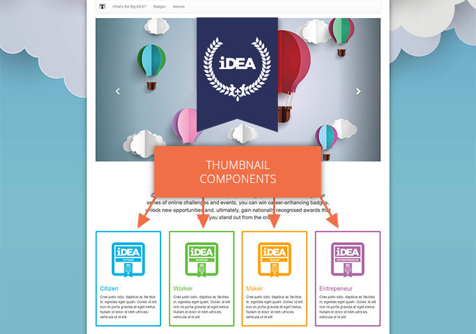
Multiple Columns
Let's try something with multiple columns using the Thumbnail component.
To split our 12 column grid into 3 different thumbnails components each covering a third of the grid, what classes will we need?
We'll need a class row of columns to stop the layout from flowing incorrectly, a thumbnail component (remember the descriptive class names that Bootstrap employs) and a class to set the width of the columns to cover one third of the grid (or four twelfths).
-
class="thumb"
-
class="col-md-12"
-
class="row"
-
class="navbar"
-
class="col-md-offset-2"
-
class="carousel"
-
class="col-md-offset-4"
-
class="col-md-4"
Now drag these into the right order to create the thumbail markup. Remember every opening <div> needs a closing </div> to tell the browser that the block of code has finished.
Well done - you seem ready to take on your first day as a Junior Web Developer - this is your chance to earn your badge.