Presenting content
There are several layout patterns that are recommended to take advantage of how people scan or read through a design. The most common are:
- The Gutenberg diagram
- The Z-Pattern
- The F-Pattern
- The Pattern of Focal Points

The Gutenberg Diagram
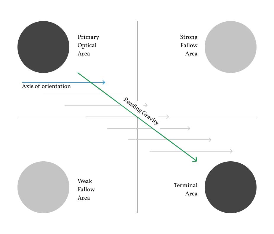
The Gutenberg diagram describes a general pattern the eyes move through when looking at evenly distributed, homogenous information.
As such, it applies to text-heavy content, like pages in a novel or a newspaper, not every possible design.
For languages that read left to right, the Gutenberg Diagram suggests that the strongest area of the page is the top left, and the weakest in the bottom left.
This is due to the eye sweeping across and down the page in a series of horizontal movements called axes of orientation. Each sweep starts a little further from the left edge and moves a little closer to the right edge.
For languages that read right to left, this is flipped, with the strongest area top right and the weakest bottom right.
The overall movement is for the eye to travel from the primary area to the terminal area and this path is referred to as reading gravity.
The Gutenberg diagram suggests that important elements should be placed along the reading gravity path. For example, placing a logo or headline in the top left, an image or some important content in the middle, and a call-to-action or contact information in the bottom right.
Designs that follow Gutenberg are said to be in ‘harmony’ with natural reading gravity.
As mentioned, this applies to dense content, which has a fairly flat visual hierarchy. As a visual hierarchy is established through using things such as colour and size, the Gutenberg diagram becomes less relevant.
The Z-Pattern Layout
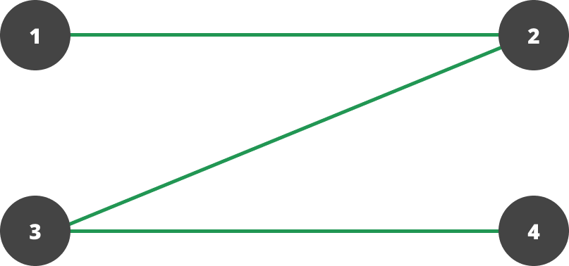
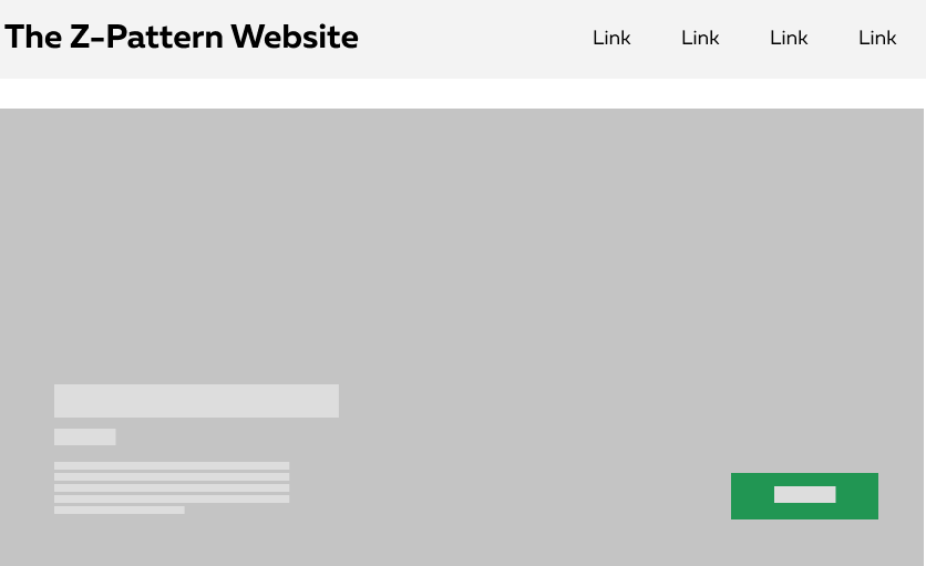
The Z-Pattern, as the name suggests, follows the shape of the letter Z.
Readers will start in the top left, move horizontally to the top right and then diagonally to the bottom left before finishing with another horizontal movement to the bottom right.
To follow this pattern, a designer would place the most important elements on the path.
Generally, the Z-Pattern is good for simple designs with a few key elements that need to be seen.
The Zig-Zag Pattern
The Z-Pattern can be extended down a page to what is known as a Zig-Zag pattern:
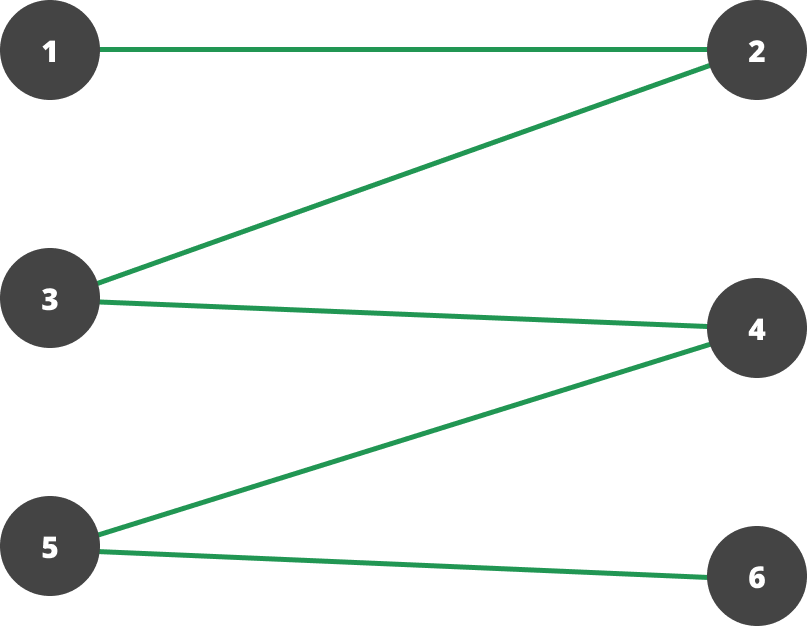
As a user scrolls down a page, the Z-Pattern gets repeated as new content appears. This is how we naturally read large blocks of text.
The Golden Triangle Pattern
There is one other variation to the Z-Pattern which is relevant.
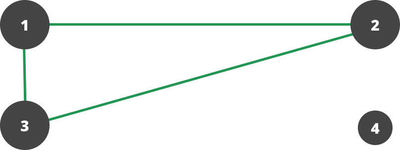
This is the Golden Triangle Pattern. This has no second horizontal movement, so point 4 has much less importance.
The triangular area at the top of the page will be the area most seen and the pattern suggests that your most important information needs to be placed inside it.
When should you use the Z-Pattern?
The Z-Pattern is best used for simple designs with minimal copy and a few key elements that need to be seen.
The F-Pattern
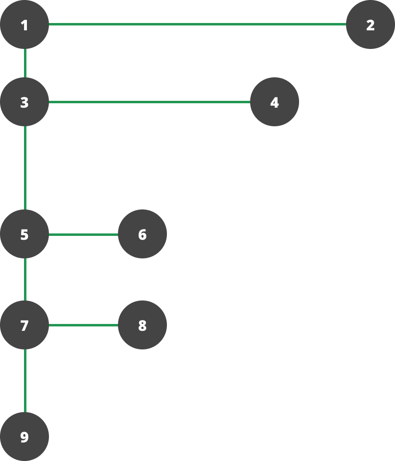
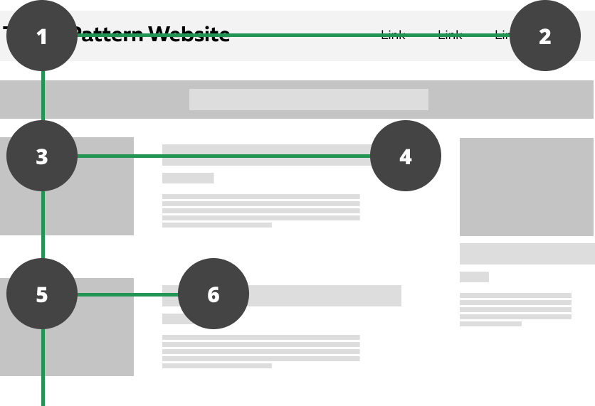
As with the other patterns the eye starts in the top left, moves horizontally to the top right and then comes back to the left edge before making another horizontal sweep to the right. This second sweep won’t extend as far as the first sweep.
Additional sweeps move less and less to the right and for the most part after the second major sweep the eye sticks to the left edge as it moves down.
This suggests that important information should be placed across the top of the design where it will generally be read.
Lesser information should be placed along the left edge of the design often in bullet points where little horizontal movement is required to take everything in.
It also works on the principle that people don’t read online, they scan.
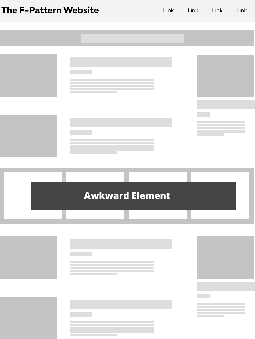
A downside to the F-Pattern is that layouts can quickly become repetitive and lose visual interest.
In these cases you should aim to break the expectations of the user through the use of an ‘awkward’ element that breaks the visual repetition.
An important thing to remember with the F-Pattern is that most of the eye-tracking evidence supporting it was gathered on tests on search result pages, or on listing pages.
Another thing to remember is that the F-Pattern possibly only applies to a visitor’s initial scan of the page. If something attracts their attention, they will read as evidenced by these heat maps:
When should you use the F-Pattern?
The F-Pattern can be seen on many of the news websites. It’s perfect for text heavy blogs and news sites. If there’s a lot of content, users will respond better when they are able to scan the content easily.
Pattern of Focal Points
While the previous patterns describe common viewing patterns of visitors to websites, it is worth remembering that establishing a visual hierarchy in a page can break the eye out of these patterns.
For example, on a page that is nothing but a headline and button in the centre of the screen, a visitor is unlikely to follow any of the above patterns beyond a glance at the top left. This is called using a focal point, and is not so much a pattern as a design principle.
The Focal Point ‘pattern’ suggests that the user will look at the most dominant element in the page first. This is the element or area with the greatest visual weight.
From there the eye will follow paths from the dominant element to other focal points in the design. The order will depend on the relative weights of these focal points as well as any visual cues indicating where to look next.
Remember this picture?
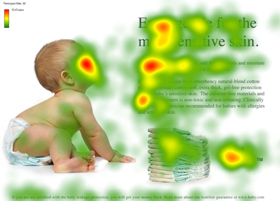
The focal point of this page is the baby’s face. The direction of the baby’s gaze gives a visual cue to the next focal point - the title of the page.
Another example of this, is this painting by Mondrian:
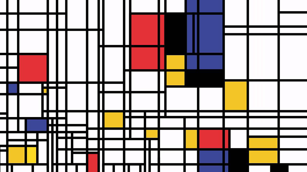
Different people may be initially drawn to different parts of the painting, but the lines within the composition lead the eye to other elements. It is highly unlikely that anyone looking at this follows the F-Pattern, Z-Pattern or Gutenberg diagram.
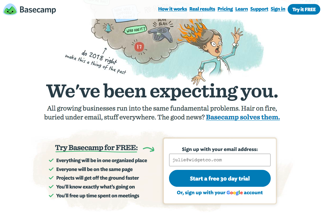
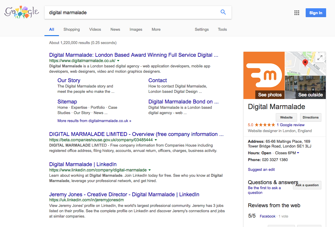
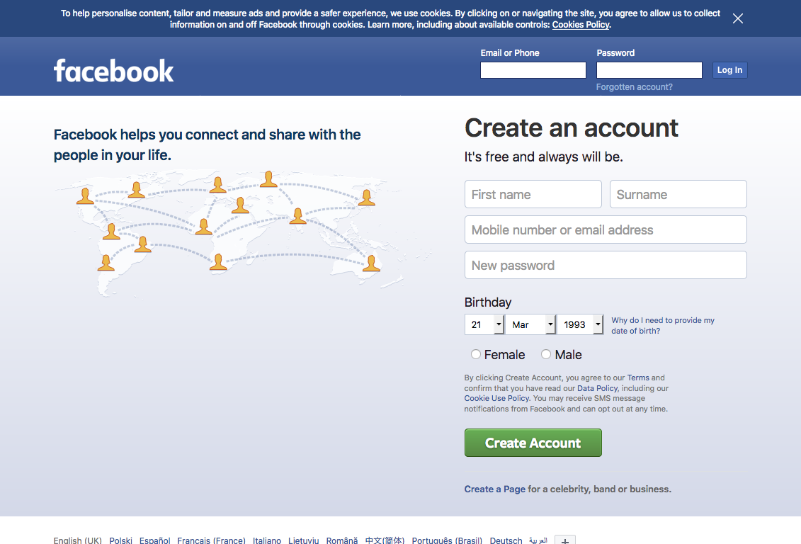
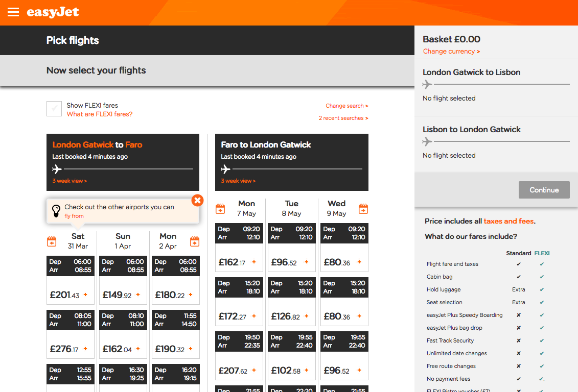
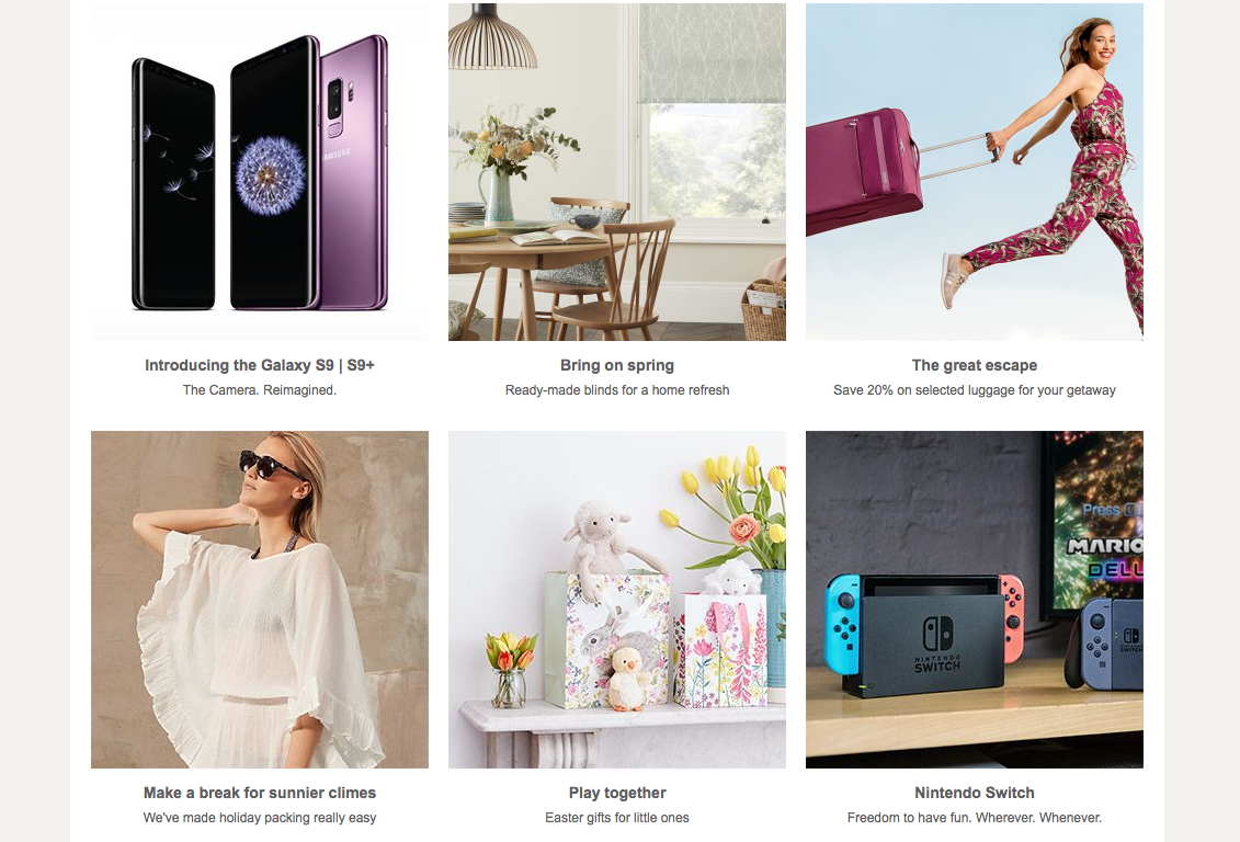
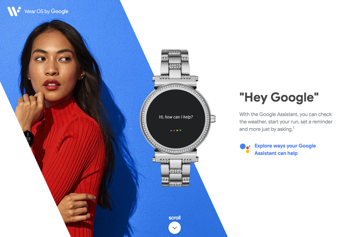
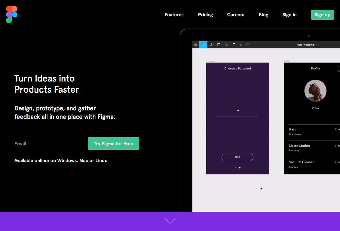
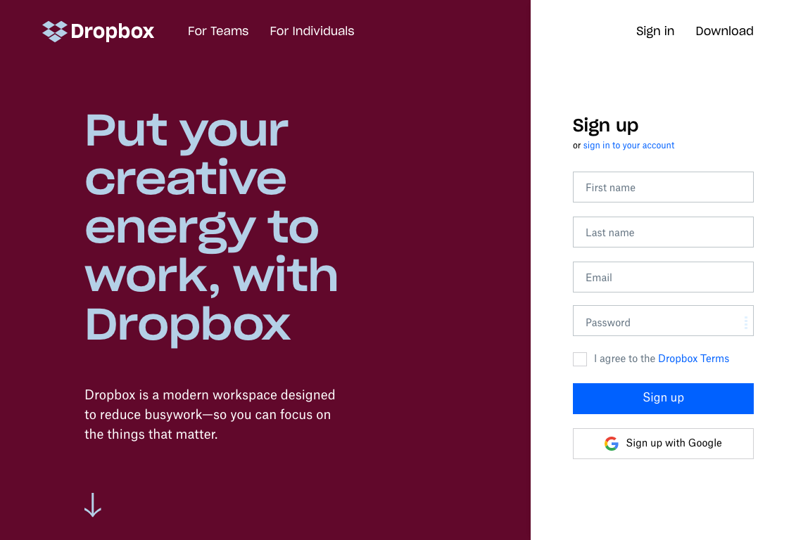
Based on what you’ve just learnt, identify the visual pattern used in these websites.

