The use of imagery
'A picture is worth a thousand words' and nowhere is this truer than when a visitor arrives at your website.
The images you use on your site can either help or hinder visitors. A well-chosen image can put your visitor at ease, reinforcing your values and making your intent clear. A poorly chosen one can leave them nonplussed and confused, which increases the chances of them leaving your site.


A group of professionals shaking hands over clipboards, for example, may evoke professionalism and competence while cartoon images may convey youth and humour. Imagery should always support the message of the page - anything that distracts from or conflicts with the purpose of the page provides an additional barrier to the visitor achieving your goal.
Look at the image below taken from a study by James Breeze using a Tobii Pro eye tracker. This is an eye-tracking heat map. The coloured areas on the page highlight where a user has looked, with the red areas being the most looked at.
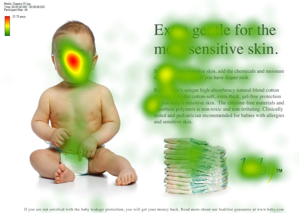
You can see that the baby’s face is the most looked at area of the page.
People instinctively notice other people and tend to focus on people’s faces and eyes, which is a good way of attracting attention.
Look at the next image below.
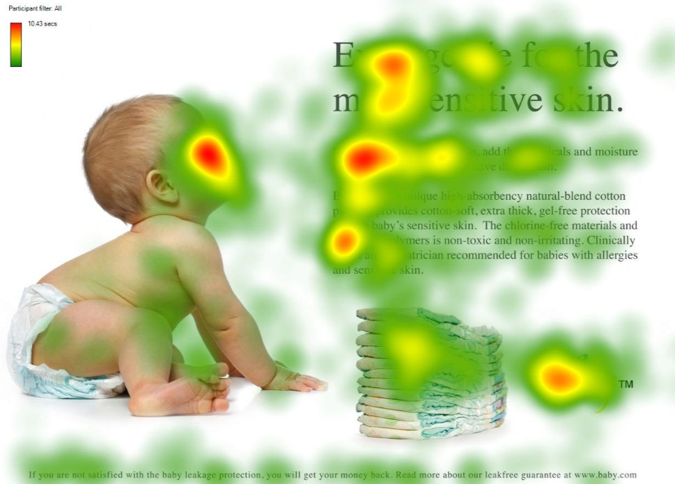
You can see that again, the baby’s face has a red area, but in addition the content that the baby is looking at also has red areas meaning it is also a heavily looked at part of the page. People look at faces but they also instinctively follow the direction the person in the image is looking in. This can be a useful tool in directing your visitors’ attention to the most important parts of your page.

Well done!
So, your user has formed their first impression of the site; you’ve successfully reassured them that your site is safe and that they are in the right place.
Now you need to do everything you can to achieve the goals of your website or page, which hopefully mirror the needs of the visitor.

